

All work
Redesigning how a nation books its flights
Nine header menus down to five: the new information architecture and design system of a national airline.
- Senior UX Designer
- Product design · Airline
- 2026
- Around 8, across two agencies
- 6 months
- Information architecture and design system
In short
I rebuilt the navigation of a national airline’s website: nine header menus became five, booking and managing a trip stopped sharing a menu, and every change went to the client with its evidence.
- 9→5
- 57
- 8
- 68
- 570
- 300+
The context
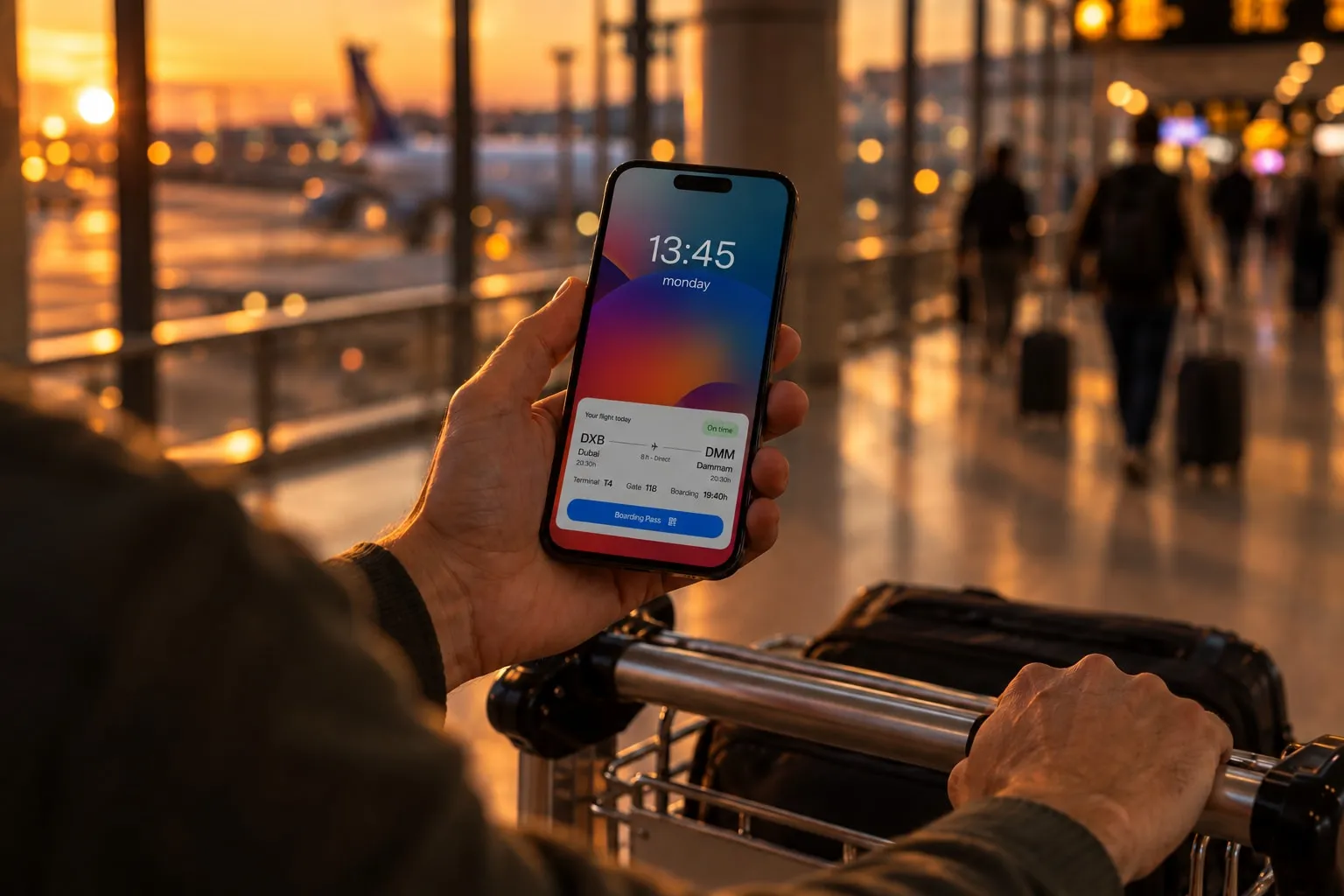
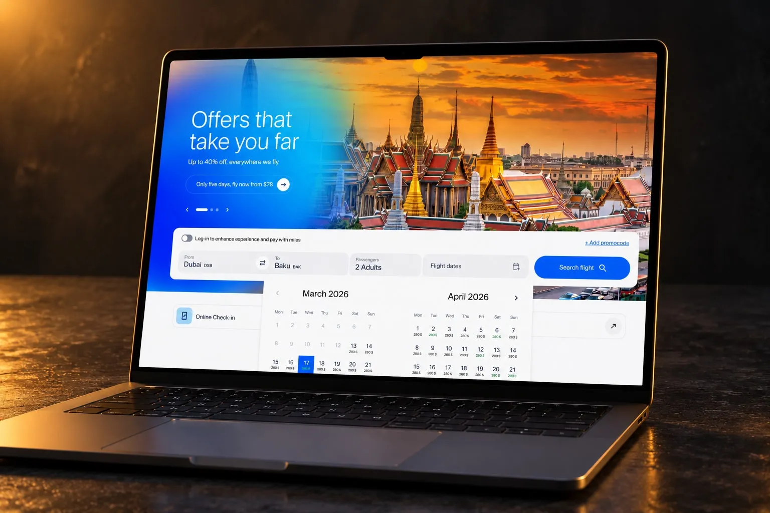
A national airline commissioned the redesign of its digital ecosystem and identity: everything from landing on the website to booking, managing a trip and using the loyalty programme, on desktop, mobile and app.
For many visitors the airline’s website is their first contact with the country. According to the brief, foreign visitors have more than tripled in 20 years, to around 3 million a year, with 4 million expected by 2028. They arrive from regions that read in different alphabets, so the design had to hold up in more than one script.
The plan was 18 weeks in three phases: research and architecture, redesign, and testing.
I joined as a freelance senior UX designer in a team spread over two agencies. The information architecture and the design system, with its documentation, were mine. The benchmark, the wireframes and the visual design I shared with other designers.
The challenge
The old navigation had grown by accumulation. Online check-in sat inside “Plan your trip”. Cabin classes were filed under “Services”. A menu called “Information” held 13 unrelated items, with fare rules next to cargo and a safety policy. Two of the nine header menus were about the company, not the passenger.
Fixing it was not only a design problem. Two client teams, e-commerce and loyalty, each wanted their content higher up, and the client wanted a familiar experience with every decision backed by what other airlines do.
My approach
The work, in order:
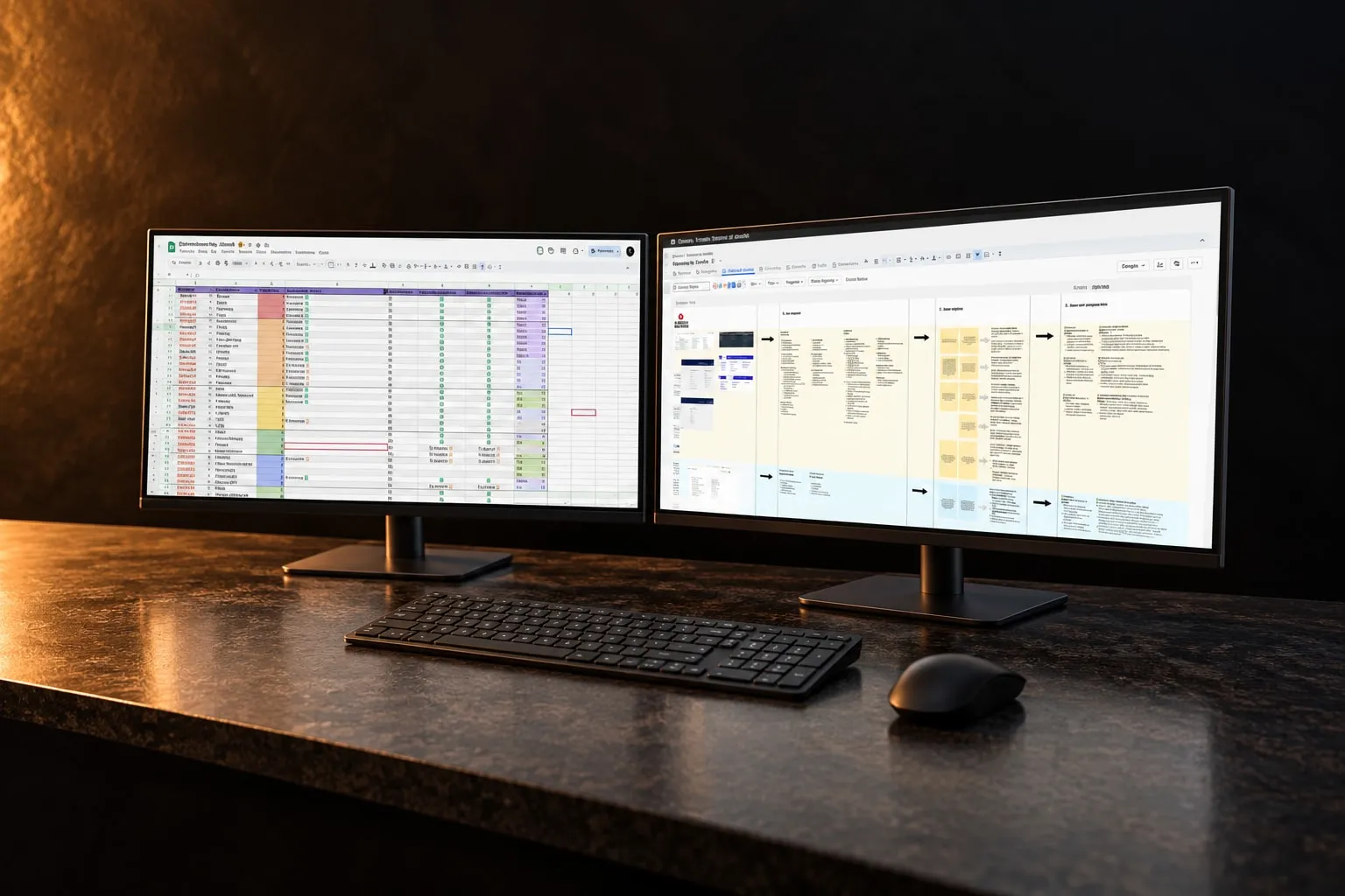
- Benchmark
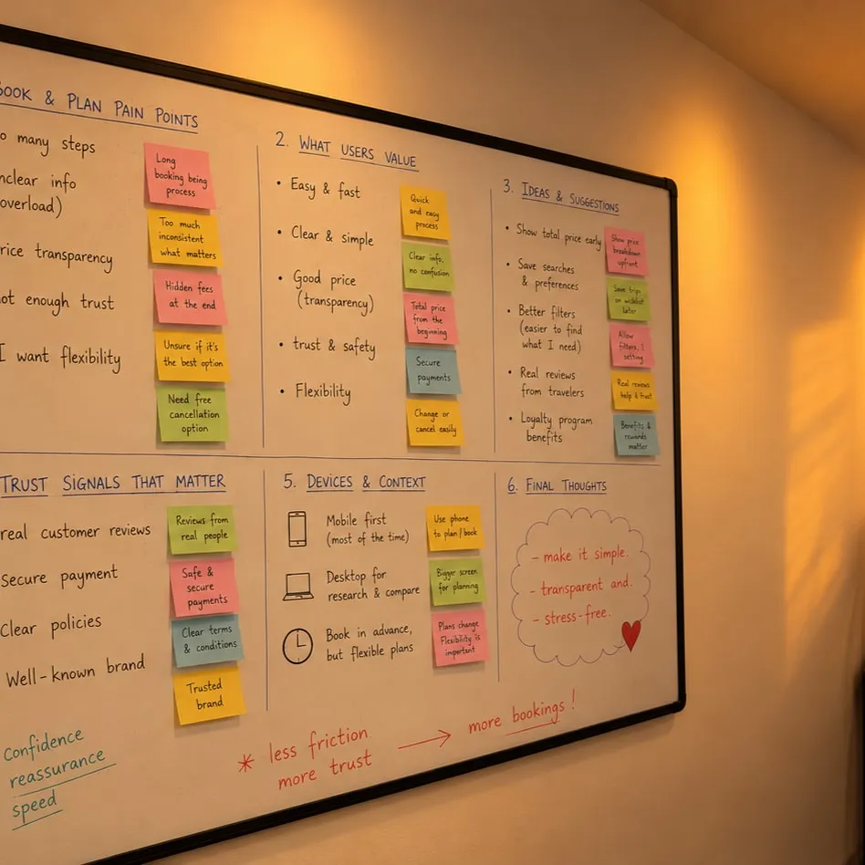
- Focus groups
- Audit
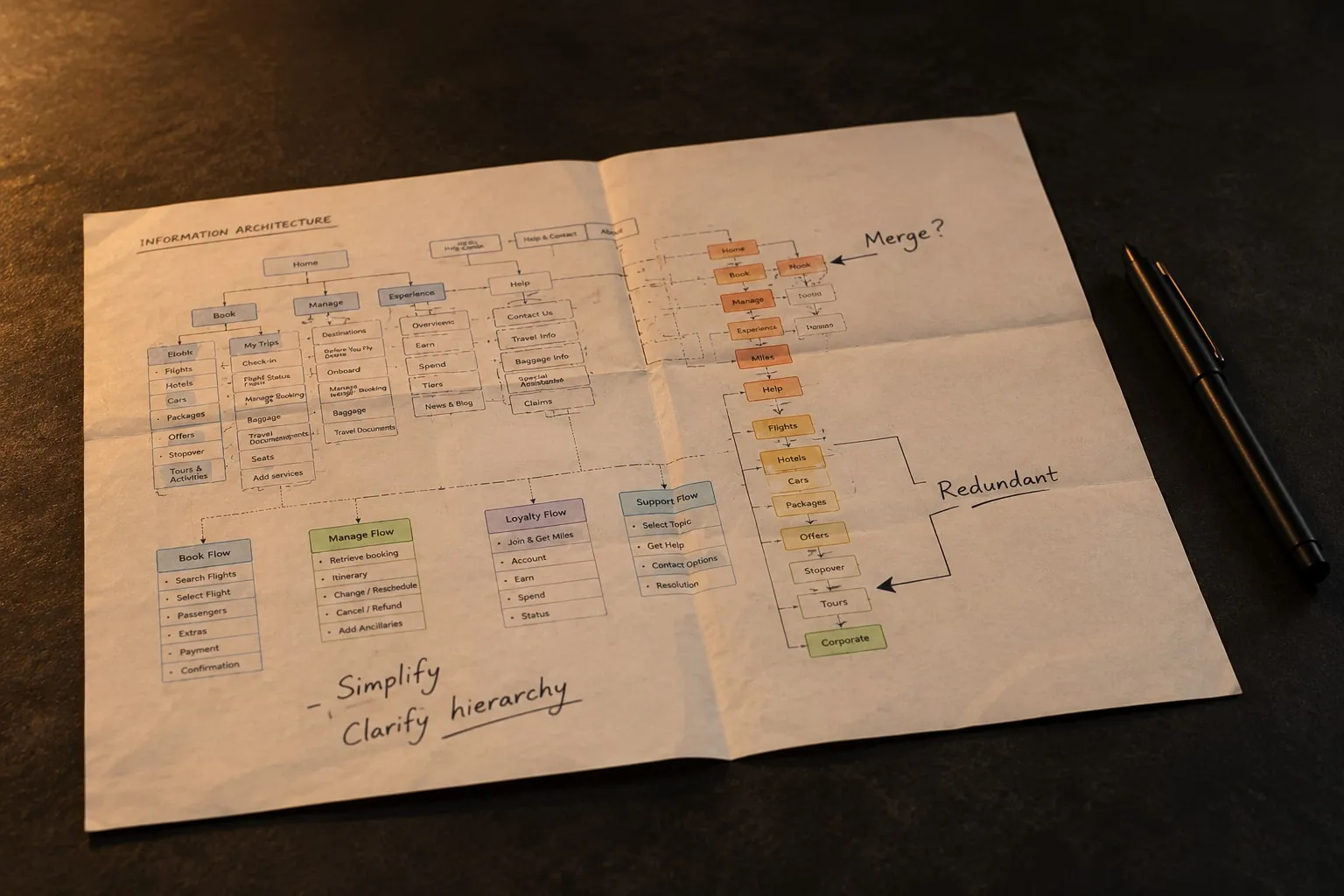
- Architecture
- Wireframes and UI
- Design system
And the decisions that shaped it:
Booking and managing a trip get a menu each
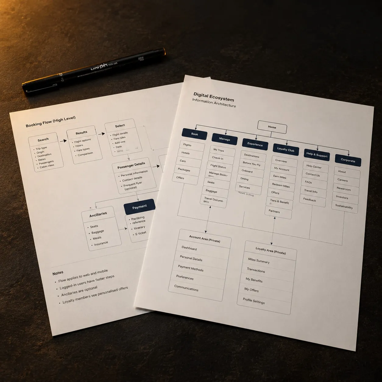
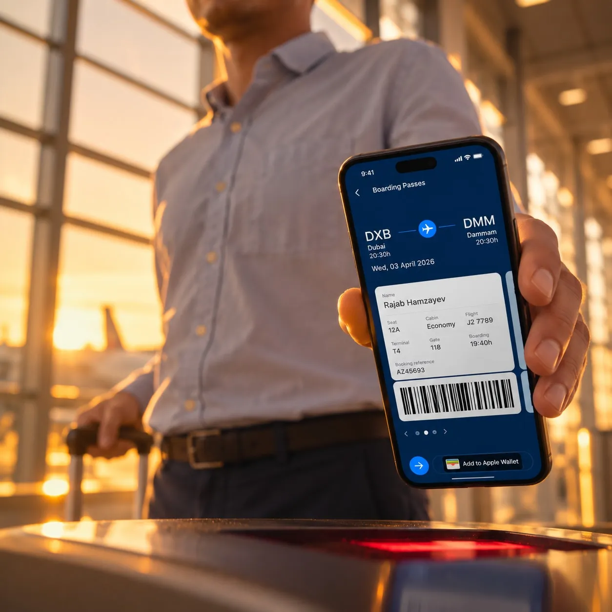
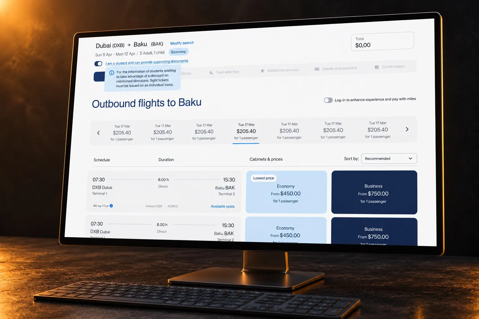
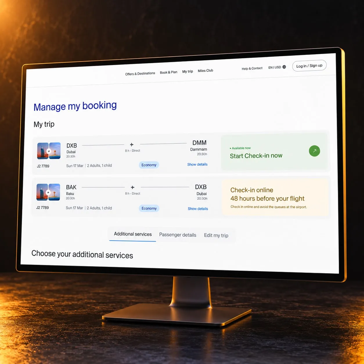
“Plan your trip” mixed three moments: before booking, booking and after booking. Someone who needed to check in right now had to open a menu about planning. All eight airlines in the benchmark separate the two, and none uses “Plan” as its booking label. Keeping one menu and only renaming it was the cheap option; I split it into “Book & Plan” and “My trip”, with check-in, flight status and baggage in plain sight.
No “Information” menu: content goes where the task happens
A label that fits everything helps nobody find anything, and no airline in the benchmark had one. Instead of tidying its 13 items, I dissolved the menu: fare rules and price hold went next to booking, baggage next to the trip, support into help, and cargo and policies down to the footer. Company content left the header too, which freed room to promote the country as a destination, as every flag carrier in the benchmark does.
The same navigation before and after login
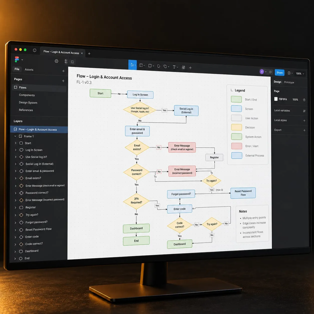
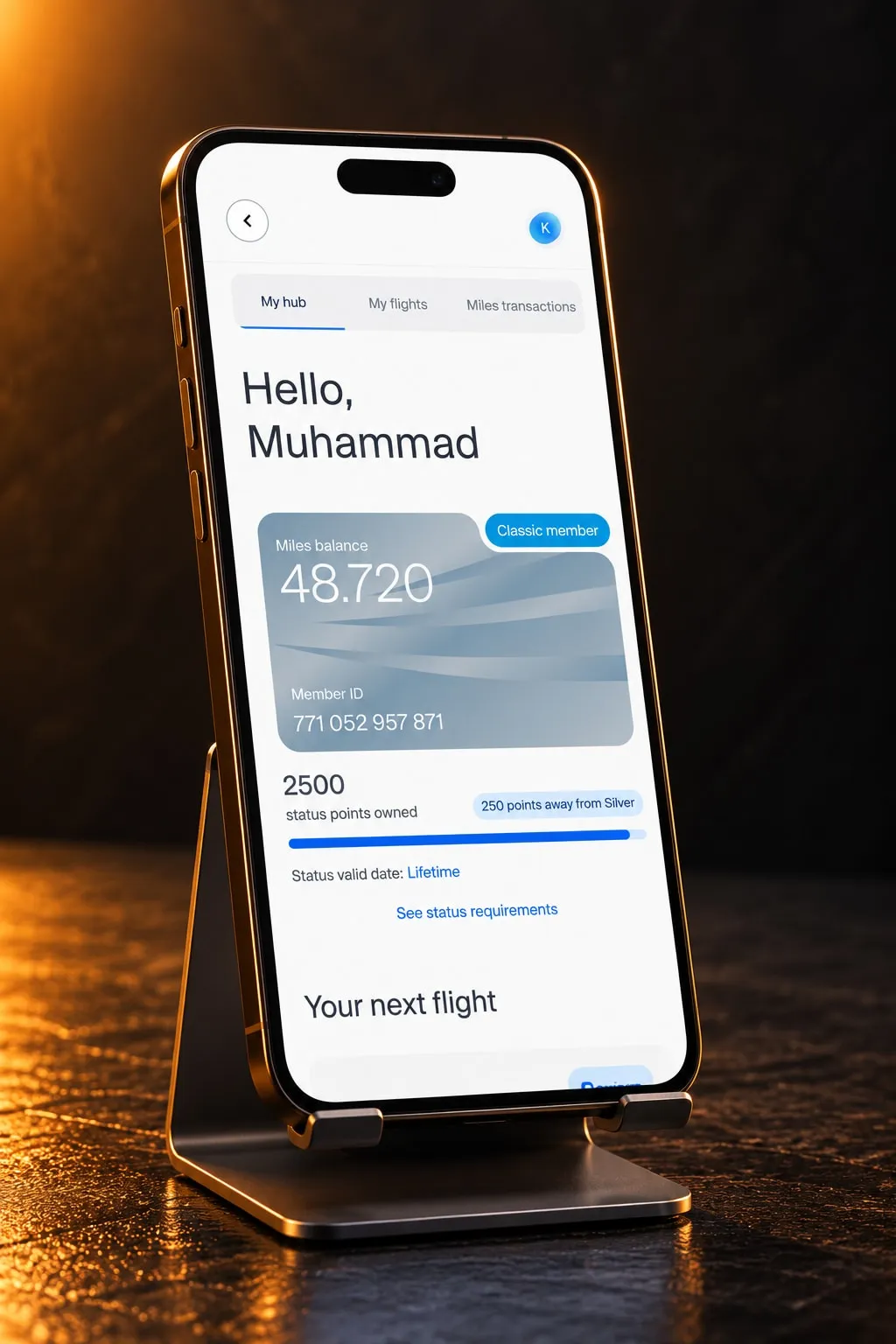
Logging in dropped users into a loyalty portal with its own sidebar, a hamburger hiding the public menu and booking actions competing with both. In the focus groups one user could not tell which screen they were on. I kept the main navigation unchanged after login and gathered the private area in one place with three parts: miles, bookings and profile.
A component only if it repeats across three screens
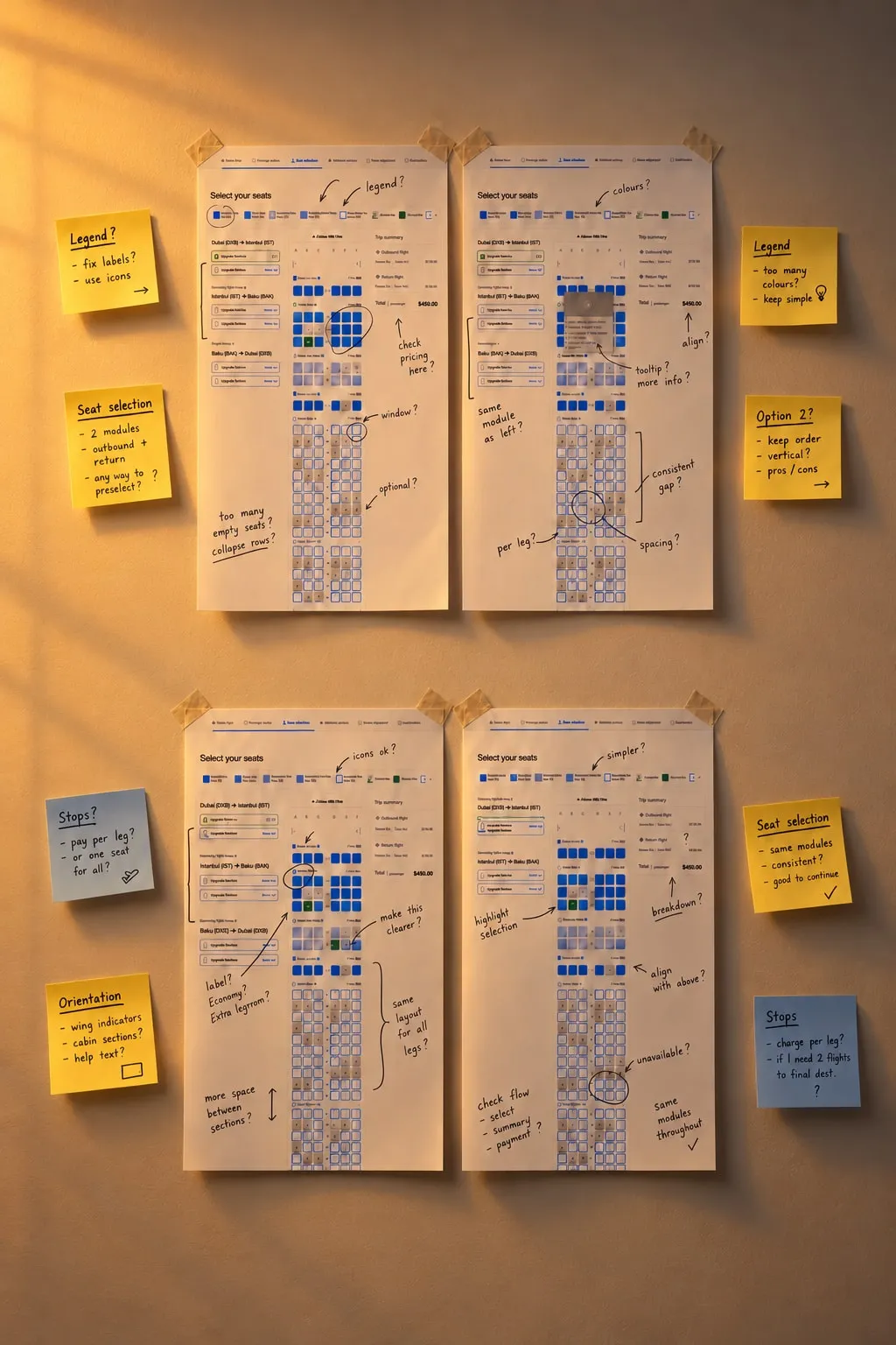
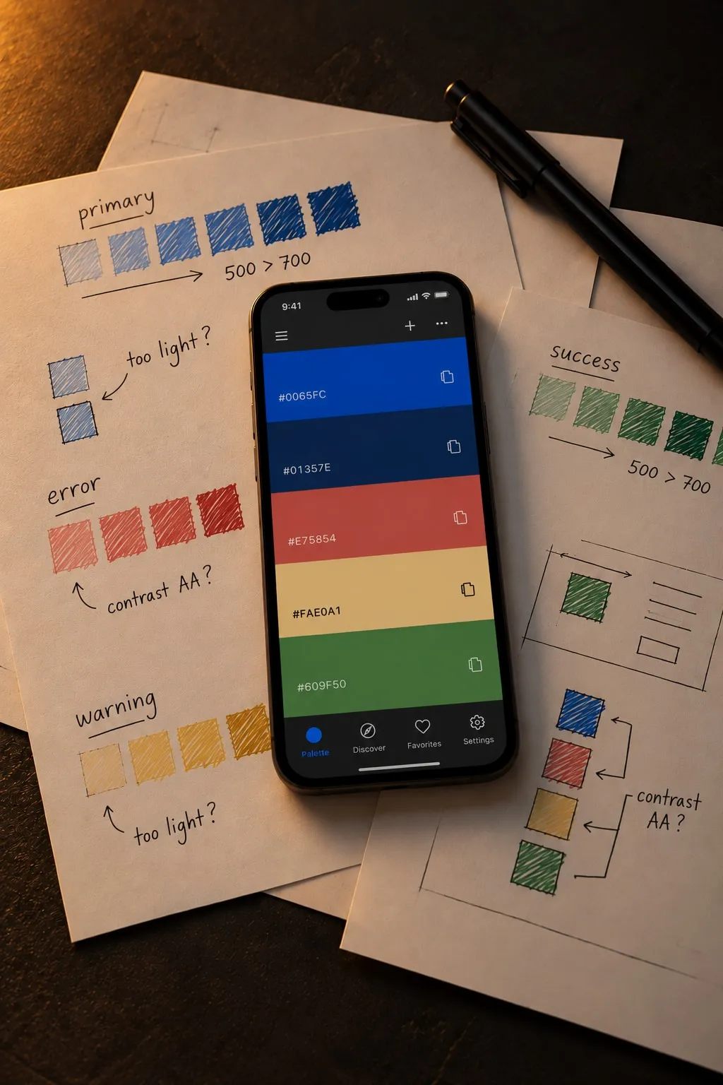
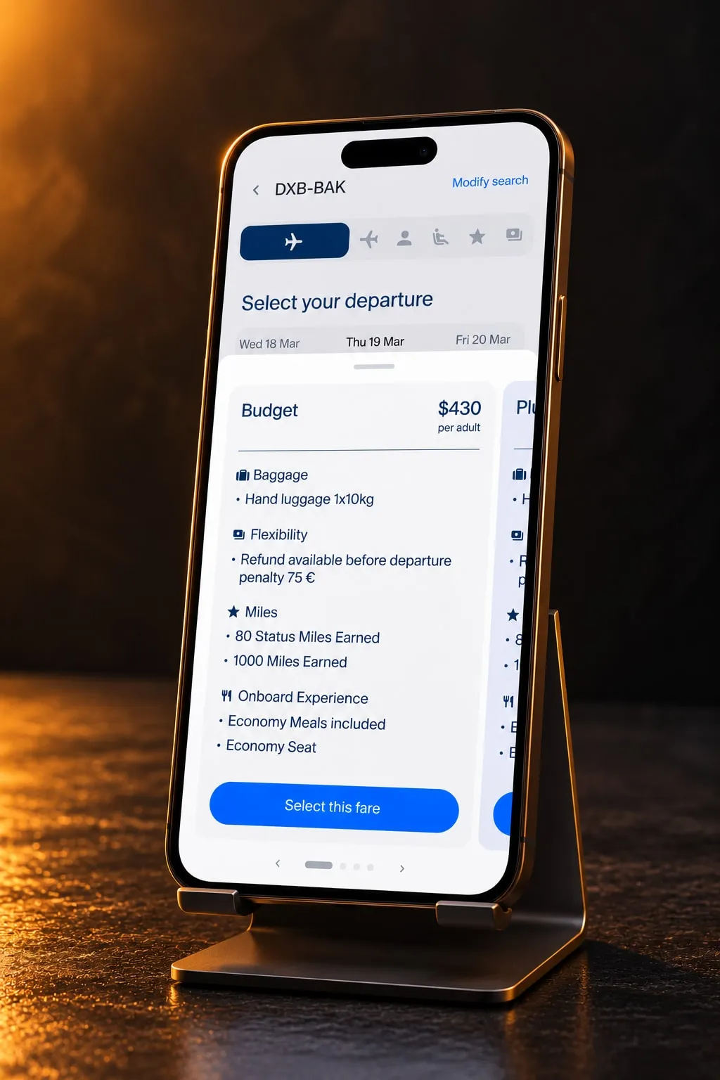
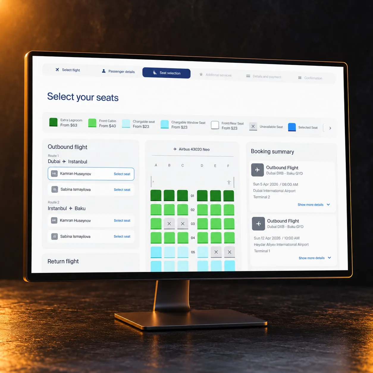
The brief gave the design system one line inside a nine-week phase that also held every screen. Once it started I was asked to turn whole pages into components, which nobody would ever reuse. The rule we settled on: if something repeats in three different screens of a flow, it becomes a component; in one or two, text styles and spacing tokens do the job. Seat selection passed the test: one seat component with its types and states, inside a larger cabin.
The results
- Nine header menus down to five
- An architecture the client signed off after two rounds of review
- 57 problems of the old navigation documented, each with data, user quotes and a fix
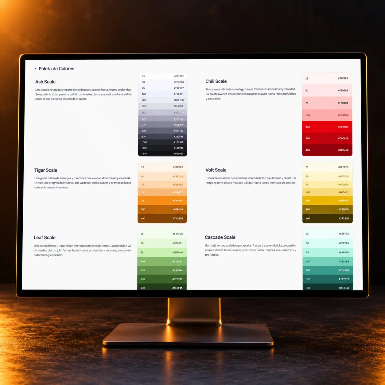
- A design system of 68 components with 570 variants, built on tokens
- A 13-item “Information” menu, gone
What I learned
Not everything survived the reviews. We recommended a plainer name for the private area, the client insisted on its own label, and we gave way. The architecture held because the argument was never my taste against theirs: each change sat next to its problem, the benchmark and what users had said.
It is the method I will reuse: compare the same flows across competitors, break the problems into blocks and tie every proposal to its evidence. What I cannot claim yet is that passengers are better off. The usability testing planned as the last phase stayed with the client, and the new site has not launched.
More case studies
Contact me
If you’ve taken a liking to me and want to get in touch, tell me about the project, the talk or your theories about Area 51. Write to me, or book a call.